Role: UX/UI Designer Year: 2021
Project Overview
CFMS is a government financial platform aimed at digitizing and streamlining manual budgeting processes previously managed in Excel. The system enables departments to plan, allocate, and track budgets across multiple offices through a unified web portal.
The goal was to design a clean, intuitive, and accessible interface that would simplify reporting, improve navigation, and ensure data accuracy.
My Contributions
As a UX/UI Designer, I was responsible for:
- Understanding user pain points and workflows through stakeholder discussions and extract valuable insights for design decisions
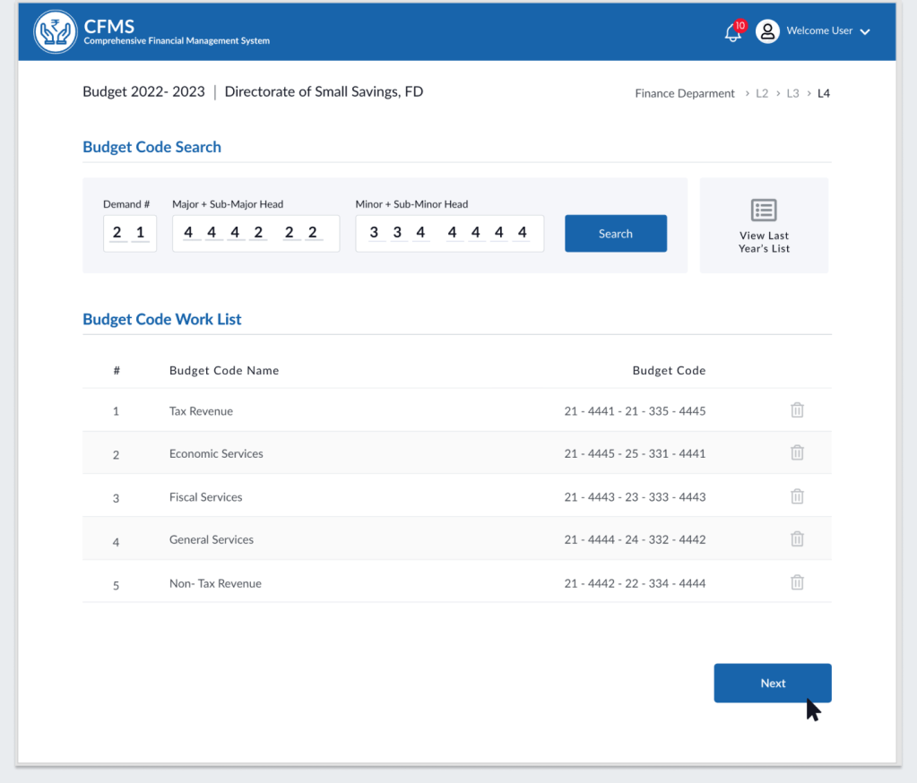
- Designing the Budget and Reporting modules, including dashboards and search workflows
- Creating wireframes, high-fidelity mockups, and interaction prototypes using Adobe XD
- Defining layout grids, color systems, and accessibility standards (WCAG 2.1)
The Business Problem (Why)
Government departments were relying heavily on offline spreadsheets for data entry, validation, and reporting—leading to redundant efforts, data inconsistencies, and difficulty tracking financial progress.
The challenge was to replace these manual workflows with a centralized web platform that allowed users to generate reports, update budget codes, and track completion status—all within a clear and consistent UI.
Design Approach
1. Target Users (Who)
- Finance Officers: Responsible for entering and validating budget data.
- Auditors and Reviewers: Needed a quick view of departmental progress and reports.
- Department Heads: Required access to summaries and analytics for decision-making.
2. Understand User’s Context and Needs (When & Where)
- When: During the annual budgeting and review cycle
- Where: Typically at government offices using desktop systems
- Needs Identified:
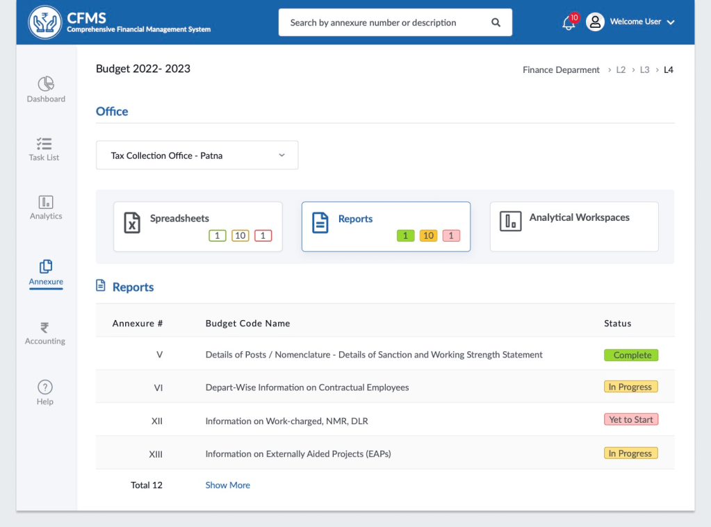
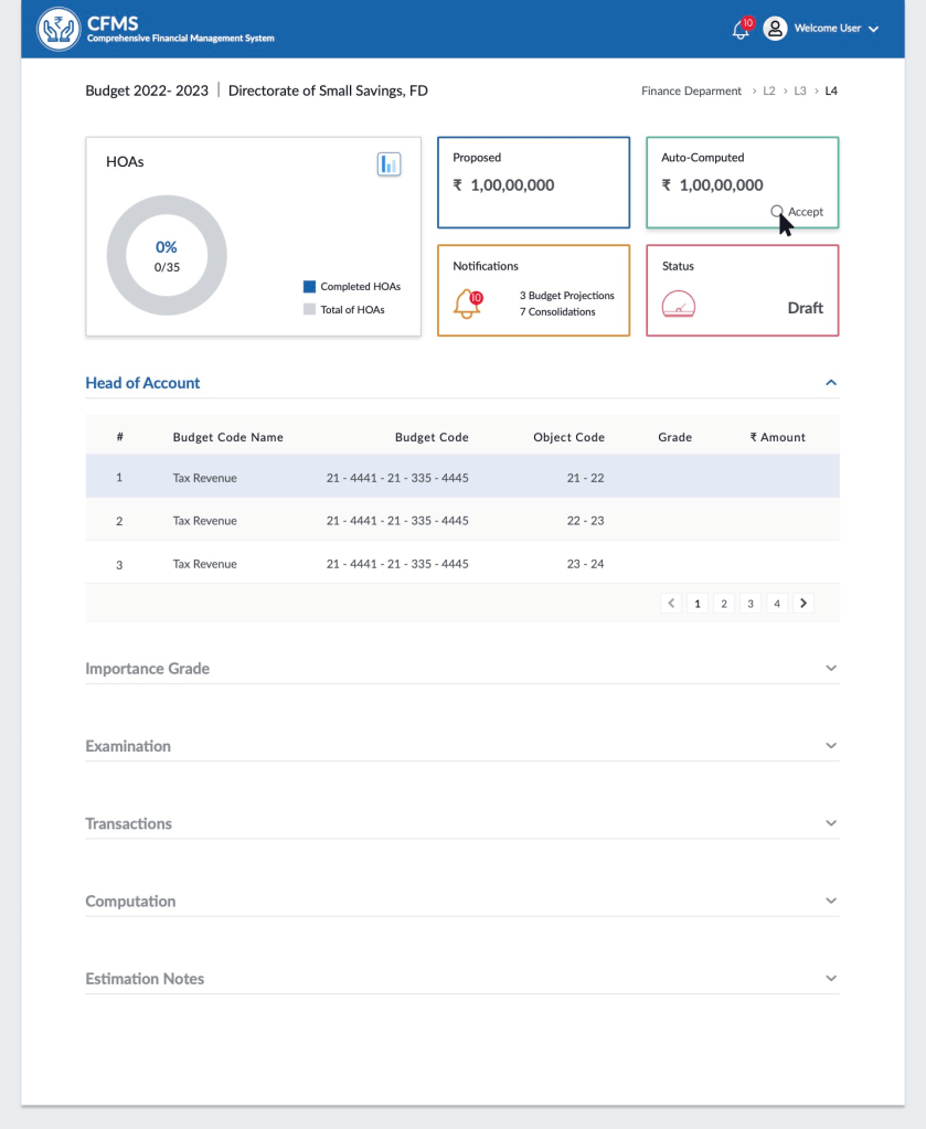
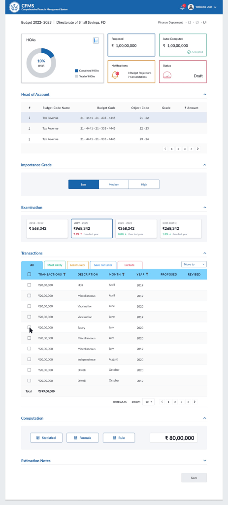
- Easy way to track progress (In Progress, Complete, Yet to Start)
- Searchable budget codes for faster navigation
- Clear visibility into departmental and annexure-level reports
3. Design Approach & Activities (What & How)
| Activity | Purpose & Outcome |
|---|---|
| Information Architecture Review | Translated Excel-based data structures into an intuitive navigation system |
| Wireframes & Layout Design | Created dashboard and search flows for report tracking and budget code management |
| UI Design & System | Built a consistent design system with reusable components, ensuring scalability |
| Heuristic Evaluation | Improved navigation and readability for better task efficiency |
| Accessibility Audit | Ensured color contrast, label clarity, and WCAG compliance |
| Developer Collaboration | Conducted design handoff sessions and provided annotated UI specs |
Design Solution
Visual Design of Few Key Screens
4. Collaboration & Developer Handoff
I worked closely with front-end developers to ensure accurate implementation of layouts, spacing, and status color codes.
As part of a horizontal UX team, my involvement concluded after the design handoff stage, when the project moved into the development phase.
5. Outcome & Learnings
Although I transitioned to another project before product rollout, the design handoff successfully equipped the dev team with a scalable design componants and interaction flows.
- Simplified navigation improved report accessibility and reduced reliance on Excel sheets
- Clear status indicators enhanced progress tracking for multiple departments
