Role: UX Designer | Year: 2022
Project Type: PoC for Govt. of India -Based on Hypothetical User Research
Project Overview
This project was a hypothesis-driven proof of concept designed to demonstrate UX design capabilities to support the RFP (Request for Proposal) for Govt. of India. Which explore how users might interact with an EV charging application. The goal was to simulate a “happy path” experience for electric vehicle users to locate, initiate, and manage a charging session through a mobile app. Although this was not a full production build, it offered an opportunity to apply end-to-end UX practices in a controlled, assumption-based environment.
Note: This project was conducted during the pandemic. Due to limited access to real users, all personas, empathy maps, and flows were created based on hypothetical user scenarios and competitor analysis to simulate ideal behaviours and demonstrate UX capabilities.
Design Problem (Why)
This app enables 2-wheeler/3-wheeler EV users to connect to BLE-based charging stations, initiate charging,
and manage billing/history. Its goal is to streamline the BLE connectivity process, minimize user input, and ensure successful sessions even with unreliable network connectivity. The solution supports a PoC demonstrating a complete Happy Flow from QR scan to charging session and invoicing. Error handling excluded.
Design Process
1. Target Users (Who)
- EV Riders (2-wheeler/3-wheeler)
- Charge Point Operators (CPO) – Backend integration
- teams (HOBS EV) – BLE hardware manufacturers
2. Use Context (Where & When)
- Where: Used during on-the-go charging at public or society chargers. At home, at work
- When: Before starting a trip (for planning), during travel (for locating stations), or while charging (to monitor status)
3. Key Features (What)
- QR Scan + BLE Pairing
- Station Finder with map-based location
- Charging session tracking (start, pause, stop)
- BLE-based device connection (simulated)
- Payment summary and session history
4. UX Approach & Activities (How)
We treated this as a full UX design exercise:
| UX Activity | Purpose |
|---|---|
| Empathy Mapping | Defined user needs, frustrations, and expectations |
| Card Sorting | Refined app’s content structure and hierarchy |
| User Task Flows | Mapped out key steps (e.g., Locate → Connect → Charge) |
| Wireframes | Built mid/high-fidelity screens using Figma |
| Heuristic Eval. | Reviewed designs for usability and accessibility gaps |
All research and design decisions were validated internally through stakeholder feedback and secondary data.
UX Activities Performed
Empathy Mapping: To understand the emotional, cognitive, and behavioral patterns of EV users. This helped visualize what users say, think, do, and feel during a charging journey.
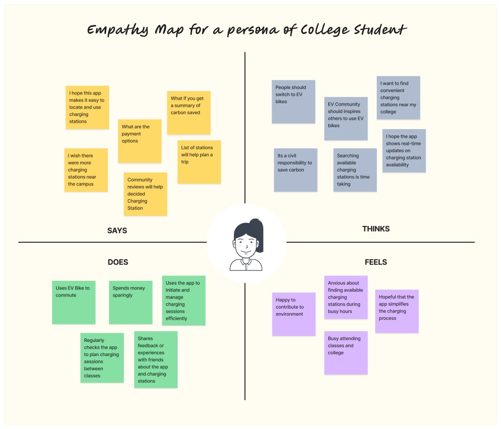
Empathy Map
Card Sorting: Conducted a closed card sorting exercise to evaluate how users would expect information to be grouped within the app’s navigation.
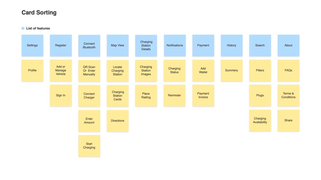
Digital Card Sorting
User Task Flow Diagram: Mapped out the “happy flow” charging journey (10 steps) from locating the charger to completing a session and viewing charging history.
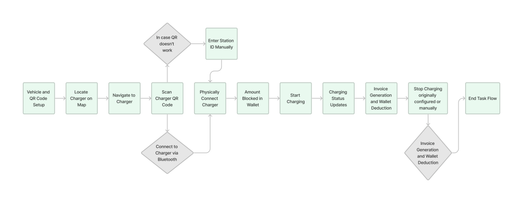
User Task Flow
Heuristic Evaluation: Assessed comparable apps to identify common pain points and UI solutions.
Wireframes & Interactive Prototypes: Created mid-fidelity screens in Adobe XD, which focused on BLE pairing, start/stop charging, and real-time feedback.
Design Documentation: Articulated UI behavior aligned with BLE technical constraints, including fallback UI states in case of disconnects or mobile issues.
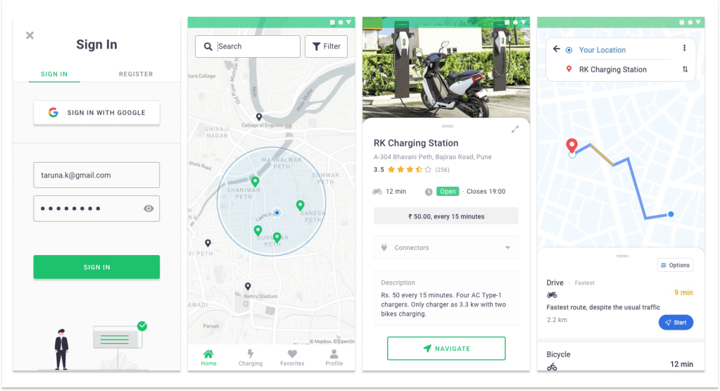
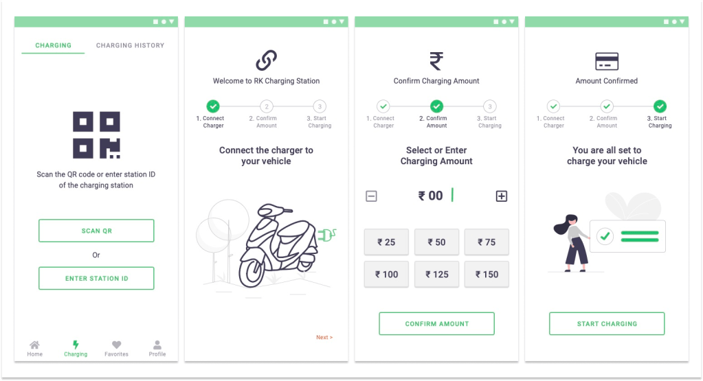
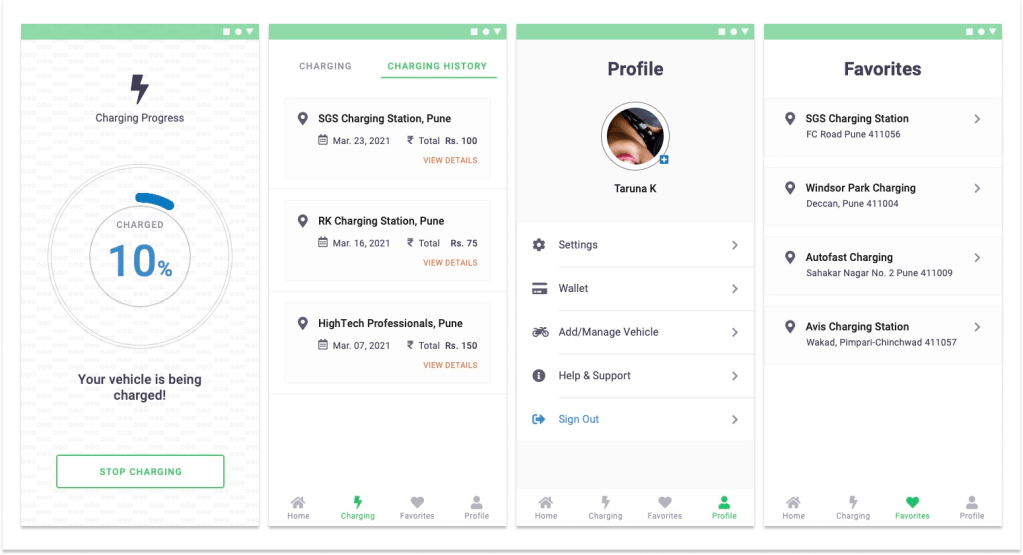
Screens from App
Key Assumptions
- No error scenarios or edge cases (e.g., charger unavailable) were addressed in this PoC
- BLE charging simulation was theoretical
- Real-time backend integrations were out of scope
Measure Success (How)
- BLE pairing success rate – Charging completion rate – Session update reliability – Invoice accuracy
- Test user feedback and bug reports
Project Learnings
Designing under hypothetical conditions taught me how to define realistic user behaviours using SME insights and assumptions.
Even without direct user access, tools like empathy maps, card sorting, and journey flows helped create meaningful structure.
This project taught me how to balance assumptions with real business needs, sharpened my UX methodology, and improved my ability to translate technical constraints into intuitive design solutions.
