Role: UX Designer Year: 2022 Tools: Figma, Miro, Heuristic Checklist, IA mapping
Project Overview
This project involved the redesign of the Customer Registration service for one of the UK’s largest banks. The existing application was built on a Windows DOS environment, with a dated, text-heavy interface and poor navigation. The objective was to modernize the interface while addressing business needs such as role-based access (read-only, limited, and maker-checker entitlements)
My Contributions
As a UX Designer, I was responsible for:
- Leading the visual design, wire-framing, and prototyping
- Interpreting user research data provided by the team
- Designing a responsive, consistent interface for both web and mobile views
- Collaborating closely with product managers, developers, and stakeholders to align UX strategy with technical feasibility and business goals
The Business Problem (Why)
The existing system has issues with role-specific features. Its MS-DOS design lacks modern aesthetics and a logical workflow, resulting in a text or data -heavy interface that is challenging to understand.
Users struggled with complex navigation, unclear information architecture, and inefficient workflows resulting in increased support tickets and lower user engagement, making financial management cumbersome.
The goal was to redesign the customer registration module into a responsive, user-friendly web application with enhanced usability, improved information architecture (IA), and alignment with enterprise compliance.

Few Screens From Existing App
Design Process
1. Target Users (Who)
- Primary users include: – Finance Administrators, Internal Auditors, Data Analysts – ERP
- Integration Managers
- Support analysts responsible for BFA data validation
2. Understand Customer’s Context and Needs (When & Where)
The BFA Web App is primarily used during monthly/quarterly closing periods when bulk financial entries need to be uploaded, validated, and posted into internal systems (e.g., SAP, Oracle). It is typically accessed from secured workstations within corporate networks.
- Analyzed existing user research data including SME interviews
- Conducted a heuristic evaluation of the current app
User Needs / Pain Points:
- Difficult-to-navigate UI, requiring manual training
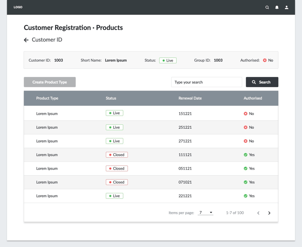
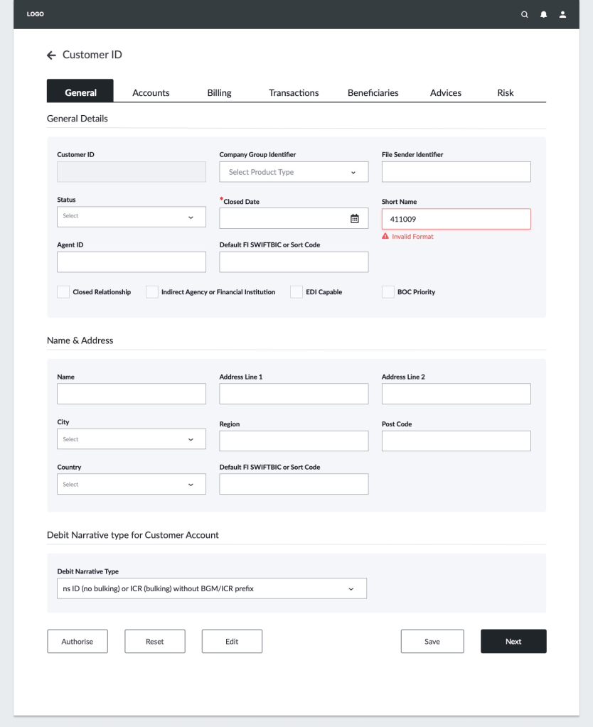
- Confusing tab-switching across “General”, “Billing”, “Transaction”, “Contact” screens
- High error rate due to poor content grouping
- Lack of feedback or error indicators for incomplete entries
- The maker-checker functionality was unclear in the previous interface
3. Design Approach & Activities (What & How)
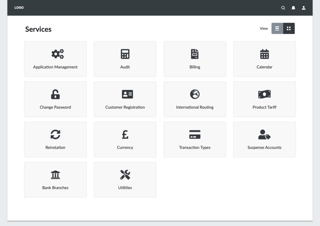
- Navigation Redesign: Simplified top-level categories with logical grouping
- Information Hierarchy: Designed layouts with strong visual hierarchy using spacing, typography, and iconography
- Modern UI Patterns: Introduced cards, tables, pagination, and CTAs for clarity
- Responsive Design: Ensured seamless access and readability across devices
| Activity | Contribution |
|---|---|
| SME Interviews | Understood current workflow pain points and technical constraints |
| Heuristic Evaluation | Identified gaps in usability, accessibility, and interaction design |
| Information Architecture (IA) Mapping | Restructured UI screens for better task grouping |
| Wireframes (Figma) | Created iterative mockups to validate content flow |
| Design QA & Handoff | Worked closely with dev team to translate wireframes into code |
4. Collaboration & Developer Handoff
- Shared annotated design specs and asset libraries
- Participated in sprint planning sessions with dev teams
- Ensured accessibility and visual consistency were maintained in development
5. Outcome
- Transformed a legacy DOS interface into a modern, enterprise-grade web experience.
- Reduced average registration time per customer by ~30% (internal benchmarks)
- Decreased manual errors and rework by restructuring field logic & adding validation cues
- Complied with enterprise accessibility standards (font, contrast, interaction design)
6. Measure Success (How)
- Upload success rate
- Error reduction vs. manual entry
- Time saved per batch upload
Logical Workflow
Wireframes- Few Key Screens
Modern Interface Design – Use of UI Patterns

Project Learnings
- Designing for legacy modernization requires balancing new UI standards with familiar workflows
- Enterprise platforms benefit from modular design systems and clear, role-based user flows
- Close collaboration between designers, developers, and stakeholders is critical for success in complex B2B environments
