Role: Sr. Visual Designer Year: 2022
Project Overview
This project centered around redesigning the e-commerce website for Tanishiq, a TATA product known for online gold and diamond jewelry. I played a key role in the visual design phase, leading the creation of website and mobile interface designs for all pages
My Contributions
- Considered responsive design principles while designing website for smooth conversion across various devices and screen sizes
- Focused on typography, color, and layout for polished interfaces, along with branding to make the website and products exciting and trustworthy
- Ensured clear content hierarchy for easy navigation and readability on the website
- Collaborated with UX researchers and developers to understand user needs and technical constraints
The Business Problems (Why)
Tanishq, one of India’s largest jewelry brands, needed to modernize its e-commerce platform to meet growing digital expectations. The goal was to improve usability, accessibility, and brand consistency across desktop and mobile, while addressing high cart-abandonment rates and low conversion on mobile.
Key Challenges:
- Inconsistent UI between website and mobile app, affecting user trust
- Cluttered layouts and unclear hierarchy, making navigation difficult
- Tedious checkout process, resulting in high drop-off rates
- Lack of visual consistency, impacting brand perception
Design Process
1. Target Users (Who)
- Online Shoppers – primarily women shopping for jewelry for personal or gifting purposes
- Mobile-First Users – a significant portion of the audience accessed the site on smartphones
- Returning Customers – loyal customers who needed a smoother, faster purchase flow
2. Understand Customer’s Context and Needs (When & Where)
- When: During festive seasons, weddings, or personal gifting occasions — times when efficiency and trust matter most
- Where: Shopping from home, on-the-go via mobile, or in-store using assisted browsing kiosks
3. Key Features (What)
- Revamped homepage, category pages, product detail pages, and checkout flows
- Responsive layouts optimized for both desktop and mobile
- Streamlined checkout experience to reduce friction
- Accessible (WCAG-compliant) UI patterns for better inclusivity
4. Design Approach & Activities (How)
By the time I joined, the UX research phase was already completed. I worked closely with the UX researchers and business teams to:
- Analyze research findings to understand key pain points and usability challenges
- Review wireframes & information architecture to ensure feasibility in the visual design phase
- Identify opportunities where UI refinements could improve accessibility and engagement
From there, I led the end-to-end visual design phase:
| Activity | Contribution |
|---|---|
| Modern UI Redesign | Developed a UI component library to ensure scalability and design consistency |
| High-Fidelity Mockups | Designed core flows including Home, product pages, cart, and checkout in Adobe XD |
| Accessibility | Ensured visual elements complied with WCAG standards (contrast, typography, button sizes) |
| Collaboration | Partnered with frontend developers to ensure accurate implementation of design specs |
5. Outcome & Impact
- 25% increase in conversion rates after implementing the new UI design
- 40% decrease in cart abandonment due to a simplified checkout process
- Improved mobile engagement, with a consistent, touch-friendly interface
- Established a scalable design system, reducing future design inconsistencies
6. Measure Success (How)
- Conversion Rate: Increase in completed purchases after redesign.
- Cart Abandonment Rate: Reduction due to simplified checkout
- Task Completion Time: Faster product search, selection, and checkout
Design For Website
Home Page
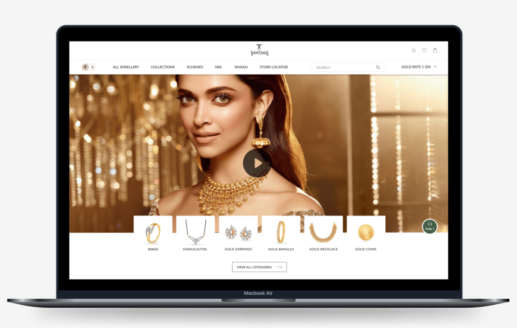
Please click on the thumbnail to view entire Home Page
Product Listing Page
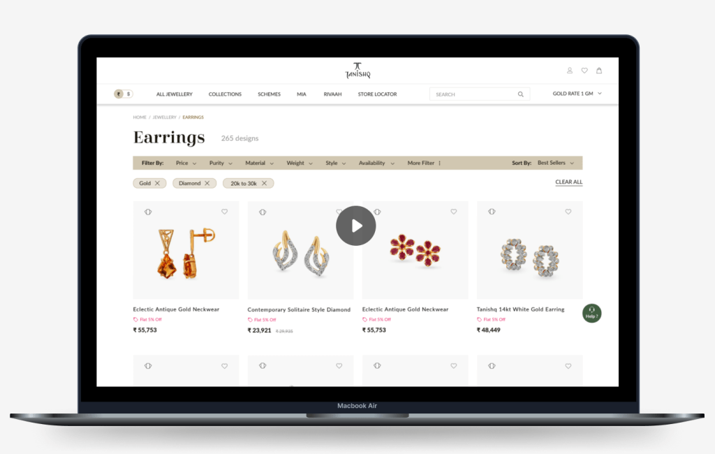
Please click on the thumbnail to view entire Listing Page
Product Details Page
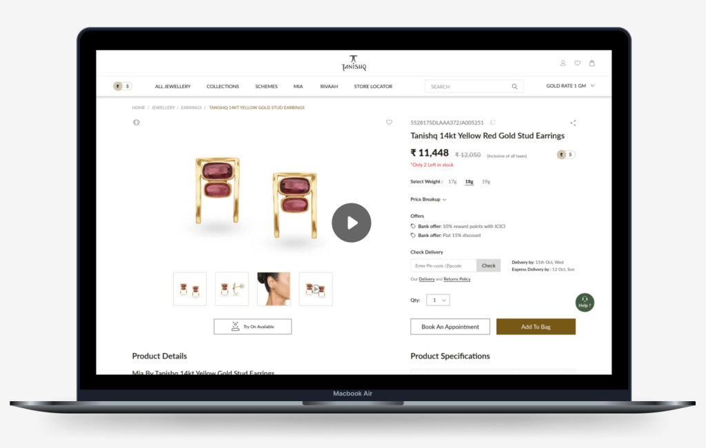
Please click on the thumbnail to view entire Product Details Page
Design Approach For Mobile
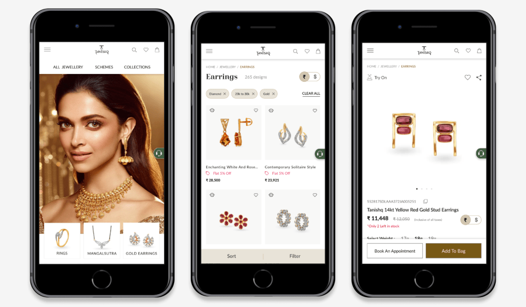
Mobile View: Lading Page, Product Listing Page and Product Details Page
While converting website design elements to mobile app, I mainly considered –
Screen Real Estate
- Ensured that elements are appropriately sized and spaced for comfortable interaction on smaller screens
Responsive Design
- Adapted the layout and design elements to fit various screen sizes and orientations. Prioritized responsive design principles to ensure a consistent user experience across different devices
Touch-Friendly Design
- Made sure that buttons, icons, and other interactive elements are large enough and spaced out to accommodate touch gestures accurately. Opted for scalable vector graphics (SVGs) to ensure crisp visuals on high-resolution mobile screens
Consistency in Design
- Maintained consistency in design elements, such as colors, typography, and branding, across the mobile app to enhance the overall user experience
Whitespace
- Used whitespace strategically to create breathing room between elements, which reduced clutter and enhanced visual clarity. Maintained consistent padding and margins to provide a comfortable viewing experience across different devices
Horizontal Scroll
- Implemented a dot indicator pattern to visually signify the presence of additional cards hidden on the horizontal scroll. Incorporated intuitive swipe gestures for effortless navigation through the card carousel, enhancing user engagement and satisfaction
Sticky Header and CTAs Position
- Implemented a sticky header to keep essential navigation options (Menu, Search, Breadcrumbs, Currency Switch ) accessible at all times. Positioned action buttons like “Sort”, “Filter”, “Add to Cart” and “Book an Appointment” buttons prominently, typically in the footer, to encourage user engagement
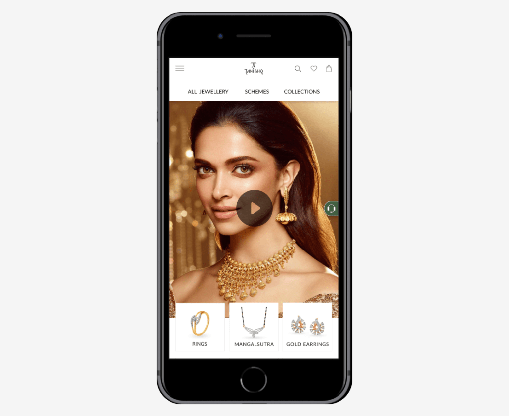
Please click on the thumbnail to view entire Landing Page
Project Learnings
Throughout this project, I gained valuable insights as a visual designer. Mastery of responsive design principles is essential when tailoring designs for diverse devices. Incorporating accessibility features is crucial for usability. Collaborating closely with UX Researchers and Developers significantly improved design outcomes. Continuously iterating based on user feedback improved the user experience. Maintaining meticulous attention to detail ensured a polished interface
 Snehal Kank