Role: UX Designer Year: 2026 Location: Halifax, NS
I worked on a full website redesign for IMWAH, a nonprofit supporting immigrant and migrant women in Halifax. The project started as a UX and information architecture exercise, but it grew into a full end-to-end redesign that included research, wireframes, visual design, design systems, and Webflow development.
The main goal was to make the website easier to navigate, calmer to look at, and more useful for people looking for support, programs, events, and resources. The redesign aimed to create a warmer, more welcoming experience with a fresher look and feel that better reflected the organization.
Project Overview
IMWAH needed a website that better reflected how people actually use its content. The old structure made it difficult to find important information quickly, especially on mobile. Since users may come to the site looking for help, programs, or events, the website needed to be clearer, faster to scan, and easier to trust.
This project became more than a visual refresh. I worked through the full process from discovery to launch:
- heuristic evaluation,
- card sorting,
- user flows,
- information architecture,
- wireframes,
- usability testing,
- visual design,
- and Webflow implementation
My Role
I led the UX and visual design work and also built the final site in Webflow. That meant I was involved in both strategy and execution, which helped keep the final website aligned with the research and design decisions.
My responsibilities included:
- reviewing the existing site and identifying usability issues,
- organizing content through card sorting,
- mapping user flows for key tasks,
- creating the sitemap and navigation structure,
- designing low-fidelity wireframes,
- building the visual system,
- creating color tokens, text styles, and components in Figma,
- testing and refining the design,
- and developing the final site in Webflow
What I Learned
A big part of this project was understanding that the website was not just an information source — it was a support tool. That changed how I approached the structure and the design.
Some content, like violence support, events, and programs, needed to be easier to reach from the homepage and navigation. Other content, like resources, needed to be grouped in a way that matched how users think about help. The research showed that people do not always categorize content the same way the organization does, so the site structure had to reflect user expectations more closely.
Research and Information Architecture
I started by reviewing the existing site and then moved into research activities to understand how the content should be organized. One of the most useful methods was a hybrid card sorting exercise with IMWAH staff and board members. That helped validate how users mentally grouped the site content and gave me a strong base for the navigation structure.
The results showed clear patterns:
- About-related content belonged together under About.
- Programs like Circle of Women and Enabling Accessibility belonged under Programs.
- Events should be a clear top-level section.
- Resources worked better when separated into Help and Guides & Tools.
I used those findings to shape the sitemap and top-level navigation. This was important because the structure needed to support both discovery and urgent access.


User Flows
After the information architecture was set, I mapped the main user journeys. I focused on three important flows:
- finding help with violence at home
- registering for an event
- and learning about Project/s (Circle of Women)
These flows helped me check whether the proposed structure would actually work in real situations. For example, someone looking for urgent support should not have to dig through several pages to find help. Someone interested in a program should be able to understand what it is and what to do next within a few clicks.

Wireframes and UX Decisions
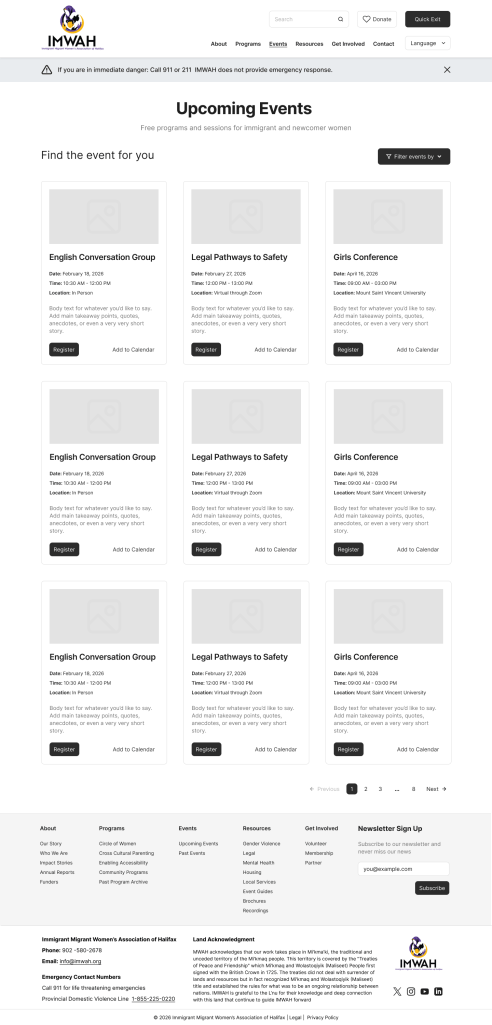
Once the structure and flows were validated, I moved into mid-fidelity wireframes for the homepage, events, resources, and program pages. At this stage, the goal was to turn the research into page-level decisions:
- what appears in primary navigation,
- what needs preview placement on the homepage,
- how resources should be grouped,
- and how pages should support both exploration and action
Several UX principles guided the wireframes:
- Safety-critical paths must be prominent
- Events should be treated as a primary user task, not buried as secondary content
- Program pages should answer “what is this, who is it for, and what can I do next?”
- Homepage content should act as a launchpad into high-value tasks rather than as a content dump


Visual Design and Brand Refresh
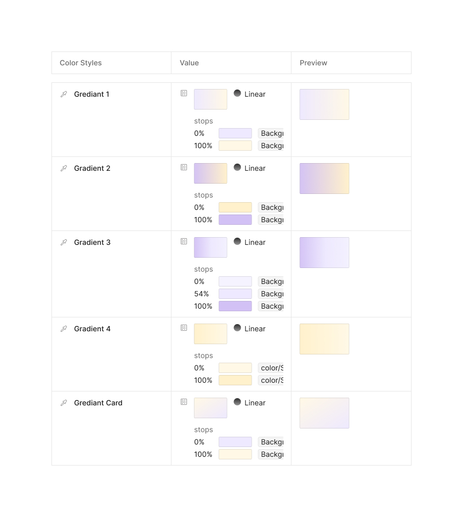
The visual direction also needed a refresh. The previous site felt heavy and dark, so I moved the design toward a calmer pastel palette with softer, more feminine energy. The goal was to create a more welcoming, less visually loud site that still felt professional and credible.
I created the color palette in Figma and translated it into tokens and reusable styles. I also developed the text styles and component system so the design would stay consistent across pages. The final direction balanced warmth, clarity, and restraint.



Webflow Development
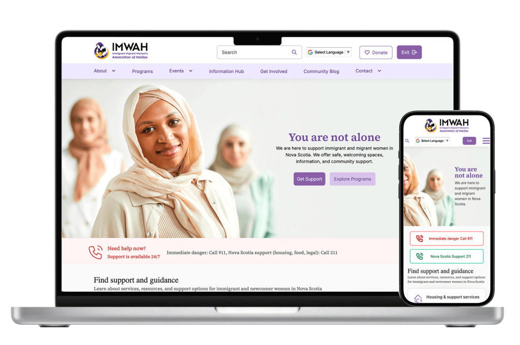
Once the design was approved, I built the site in Webflow. This included translating the design system into the live site, setting up the page structure, and making sure the experience worked well across screens.
I also used this phase to make practical adjustments where needed, especially for responsiveness and content management. Because I handled both design and build, I could make sure the final experience stayed close to the original intent.
Outcome
The redesign gave IMWAH a cleaner and more organized website structure, a calmer visual identity, and a clearer path for users to find what they need. It also gave the organization a more maintainable system to build on after launch.
For me, the most valuable part of the project was seeing research turn directly into structure, structure turn into design, and design turn into a working website. It was a full end-to-end project, and it strengthened how I approach user-centered design for nonprofit and community-focused work.

